Amos Trust
Helping supporters better understand the work, connect with campaigns and take meaningful action.
Amos Trust is a small, creative human rights organisation working with communities around the world to challenge injustice and build hope. Their work spans climate justice, human rights and supporting communities in Palestine.
The challenge
The website had evolved organically over time, resulting in a structure that made key content difficult to find and navigation increasingly unclear.
This created friction across several key areas: users struggled to discover campaigns and understand how they connected to the wider organisation; important context about the work was often buried or fragmented; donation journeys lacked clarity and created unnecessary decision points; and the overall experience didn't consistently guide users towards meaningful action.
The result was a site that required more effort from users than it should, particularly for first-time visitors and potential supporters.
UX work
I worked closely with Amos Trust's Head of Communications across the full website experience, focusing on how people moved through the site and where that experience broke down.
The work combined UX review, content analysis and journey mapping to understand both user behaviour and organisational intent.
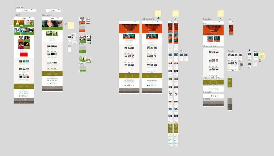
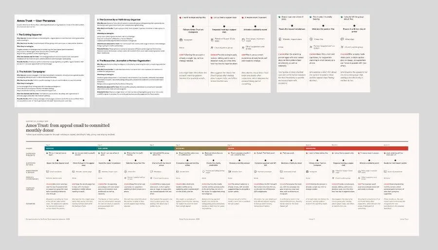
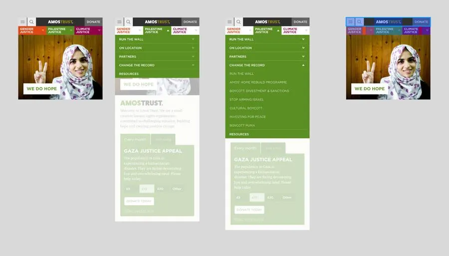
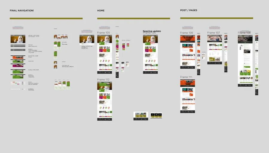
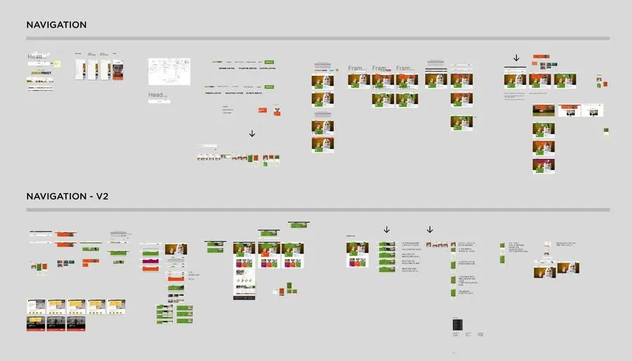
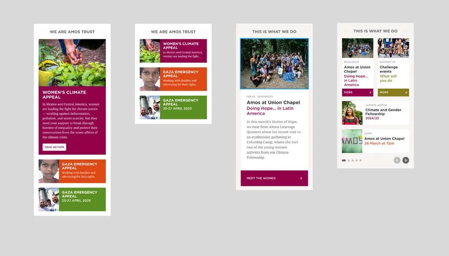
We focused on
- How people discovered projects and campaigns
- How they understood the organisation's work
- Where journeys became unclear or overwhelming
- How people moved towards donating
What we found
Users often entered through campaign content but struggled to connect it to the broader work of Amos Trust. Without that context, engagement dropped.
The navigation offered too many parallel paths, making it harder for users to build a clear picture of the organisation and what it stood for.
Donation journeys introduced too many choices too early, disrupting confidence at a critical moment of intent.
The experience needed to reduce cognitive load and provide clearer, more intentional pathways from discovery through to action.
What was designed
The work was guided by three principles: reduce choice, strengthen narrative flow and prioritise clear action pathways. These informed both structure and interaction design across the site.
- Restructured navigation to prioritise key areas
- Simplified how campaigns and projects are presented
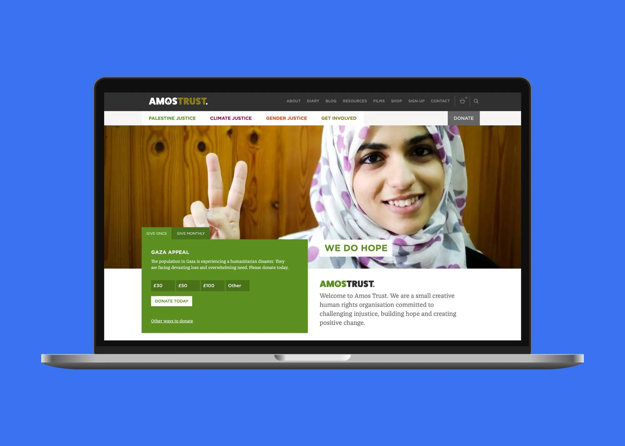
- Reduced friction in the donation flow
- Strengthened pathways from campaign discovery through to action and support
- Improved content hierarchy to better communicate the organisation's purpose
The focus throughout was on creating a more direct and coherent experience, where users could understand the work and act on it without confusion.
Outcome
The redesigned site creates a clearer and more focused experience for both new and returning users. Supporters are now able to find relevant campaigns and information more easily, understand the organisation's work with greater clarity, and move through the site with less friction and uncertainty.
The donation experience in particular is more simple and direct, helping reduce hesitation at key decision points and supporting a smoother path to contribution. Overall, the new structure better aligns storytelling with action, strengthening how Amos Trust connects people to their work and the impact it exists to create.
Graeme listens. He's flexible but focussed. He 'gets it'.
Head of Communications Amos Trust